Buttons are a fundamental element of web design, playing a crucial role in user interaction. Mastering the art of button design not only enhances the visual appeal of your website but also contributes to a seamless user experience. In this tutorial, we’ll explore how to create stylish and interactive buttons using HTML and CSS.
HTML Structure
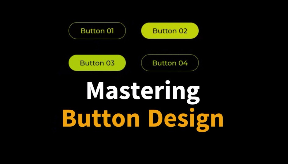
Let’s start with the HTML structure. In our example, we have a simple HTML document that includes a title and a container with four buttons.
<!DOCTYPE html>
<html lang="en">

<head>
    <!-- Meta tags and title -->
</head>

<body>
    <h2>Mastering Button Design</h2>
    <div class="container">
        <button class="button01">Button 01</button>
        <button class="button02">Button 02</button>
        <button class="button03">Button 03</button>
        <button class="button04">Button 04</button>
    </div>
</body>

</html>
CSS Styling
Now, let’s delve into the CSS styling that brings our buttons to life. We’ve used the Montserrat font from Google Fonts for a clean and modern look.
@import url('https://fonts.googleapis.com/css2?family=Montserrat:wght@400;500&display=swap');

* {
    /* Resetting styles */
}

body {
    /* Setting a dark background */
}

h2 {
    /* Styling the title */
}

div.container {
    /* Centering the button container */
}

button {
    /* Styling common button properties */
}

/* Individual button styles */

button.button01 {
    /* Button 01 styles */
}

button.button02 {
    /* Button 02 styles */
}

button.button03 {
    /* Button 03 styles */
}

button.button04 {
    /* Button 04 styles */
}

/* Hover effects for each button */

button.button01:hover {
    /* Hover effect for Button 01 */
}

button.button02:hover {
    /* Hover effect for Button 02 */
}

button.button03:hover {
    /* Hover effect for Button 03 */
}

button.button04:hover {
    /* Hover effect for Button 04 */
}
Understanding the Styles
Common Styles for Buttons:
- All buttons share common styles such as margin, width, padding, border-radius, and transitions for a consistent look and feel.
Individual Button Styles:
- Each button has its unique styles defined by classes like
button01,button02, and so on.
- Each button has its unique styles defined by classes like
Hover Effects:
- Hover effects enhance user interaction. Buttons change background colors and text colors on hover, creating a visually appealing effect.
